

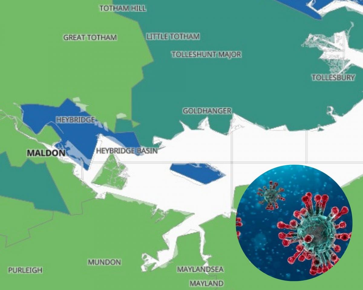
A map has revealed where in the district has the highest infection rate.
The map displays weekly data from March when the pandemic began.
The latest data is for the week leading up to October 10.
It shows the rate of infection in each area and where positive cases have been confirmed in recent days.
It is based on pillar 1 and pillar 2 testing data from Public Health England.
Areas are then colour coded based on the infection rate.
Here's a closer look at Maldon:
Heybridge
The map shows the highest rate in the district is in Heybridge, which has an infection rate of 105.3.
Nine cases have been confirmed in the area in the last seven days.

Maldon South
Maldon South has the next highest rate in the district at 90.8 and seven cases confirmed over the last seven days.

Maldon North
This area falls into the light green category with an infection rate of 43.2.
Three new cases have been confirmed over the last three days.

Mayland, Althorne & Cold Norton
Mayland, Althorne and Cold Norton also fall into the light green category with an infection rate of 28.1 and three confirmed cases in the last seven days.

Danbury and Bicknacre
This area has an infection rate of 32.8 and three confirmed cases in the last seven days.

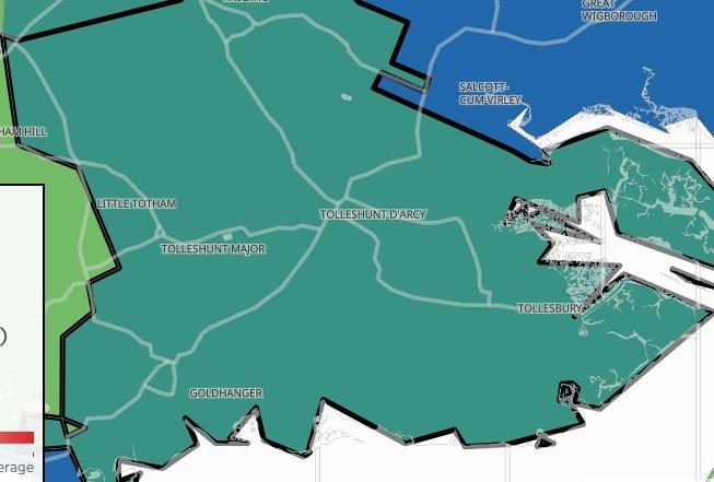
Southminster, Bradwell and Dengie Peninsula
This are also falls into the light green area with an infection rate of 43.6 and four new cases in the last seven days.

South Woodham Ferrers South
This area has a slightly higher infection rate and falls into the dark green category with an infection rate of 87.5.
Seven cases have been confirmed in the last seven days.

Great Totham, Wickham Bishops & Woodham
This area has an infection rate of 40.0 and had three cases confirmed in the last seven days.


Comments: Our rules
We want our comments to be a lively and valuable part of our community - a place where readers can debate and engage with the most important local issues. The ability to comment on our stories is a privilege, not a right, however, and that privilege may be withdrawn if it is abused or misused.
Please report any comments that break our rules.
Read the rules hereLast Updated:
Report this comment Cancel